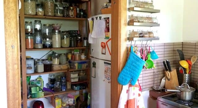
One of my favourite places in the house is the kitchen. It’s a large open and airy space and from it I can see and hear everything that is going on in the house. I call it ‘mama central’ – zone 0 of our permaculture system.
I love the way my pantry design has worked out. I designed it to be a doorless room – a short reach from the oven and main workbench. This is where the fridge is, where all the food is stored, and all the containers are kept. The cupboards and drawers below the kitchen bench only have pots, crockery, cutlery and the appliances.
 |
| Fridge and food are in the pantry – this keeps the kitchen far more open and light. |
I had originally thought I’d screen the pantry contents with a beaded door curtain, but the kids were really little then and it just kept getting pulled down. I actually much prefer it without – it’s easier to move in and out of the space, and I really like seeing all the jars of great organic produce.
The pantry shelves are not deep and almost everything is stored in glass jars so I can quickly see what I have to work with, and what I need to replace. I also much prefer storing items in glass than plastic.
I was also quite keen to keep the big fridge out of the main room to avoid cluttering the simple lines of the kitchen. The kitchen is part of the main room and the first thing you see when you come into our house. Also there’s not a lot of wall space in the kitchen for the fridge or shelves because there are so many windows letting in natural light, sliding open to the verandah, and framing views across the lake to the national park.
 |
| I’m so glad we added the sliding windows from the kitchen to the verandah. Thanks to my Dad for making the beautiful wooden frames. |
The fridge in the pantry works because there is no ceiling. This allows heat from the fridge to escape up to the apex of the house and be drawn out through the upper louvres. The pantry stays dark and cool.


